|
|
| Author |
Message |
lucero

Group: Members
Joined: 20 May 2009
Posts: 280
Gold: 8.30
Clan: DESIGN UNLIMITED

Status:
Warn: 
Reputation: 6
|
 #1 Posted: 04 Jul 2010 03:20 pm Post subject: Come 'n Criticism #1 Posted: 04 Jul 2010 03:20 pm Post subject: Come 'n Criticism |
 |
|
i know its really monoton and text is bad
but well the rest? cnc it

_____________________
[CENTER]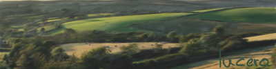 
Trata a la gente como te gustaria que te trataran a ti, y ayudalos a convertirse en mejor persona.
Wo liebe drauf steht is auch liebe drin.[/CENTER] |
|
| Back to top |
|
 |
Greg The Random
Group: Banned
Joined: 27 Oct 2009
Posts: 1265
Gold: 0.10

Status:
Warn: Banned
Reputation: 21

|
| #2 Posted: 04 Jul 2010 04:01 pm Post subject: Re: Come 'n Criticism |
|
|
| lucero wrote: | i know its really monoton and text is bad
but well the rest? cnc it
|
Hmm... well I'd give it 6/10, but I'm no graphic artist, and my sig isn't any better so let's give you an 8/10, because I probably couldn't do it. It looks like those premade backrounds though, I forget what they're called, and Idk who that random guy is but the text would be cooler if it was more of a lime green ?
_________________
This user's signature has been disabled |
|
| Back to top |
|
|
the_pillo
The Magnificent

Group: Verified Member
Joined: 09 Jul 2009
Donor: 
Posts: 1105
Gold: 0.00
Clan: Honor
Status:
Warn:
Reputation: 32
|
| #3 Posted: 11 Jul 2010 09:50 pm Post subject: Re: Come 'n Criticism |
|
|
| lucero wrote: | i know its really monoton and text is bad
but well the rest? cnc it
|
its interesting your use of sharp lines with curvature whiter lines is nice, the biggest issue i have is nothing pops.. its all very..... not to be mean but plain. Theres nothing that immediately grabs my attention. but in terms of monochromatic its nice, maybe blend the left side a little behind the fella so that he seems to pop a little more. maybe go with a lighter font or try putting it on the rightside in the darkness away from the light side of the right.
Just some ideas, hope they help
_____________________

Happiness is a disease, and smiling is the cough that spreads it - pillo-
"When you understand why you dismiss all the other possible gods, you will understand why I dismiss yours." |
|
| Back to top |
|
|
Hahmo
Group: Members
Joined: 16 Aug 2010
Posts: 1
Gold: 1.00
Status:
Warn:
Reputation: 0
|
| #4 Posted: 16 Aug 2010 09:18 am Post subject: |
|
|
You should lower the contrast and add some depth with blurring some parts far behind and in front of the asian guy. Also the render/stock is very low quality.
Only really like the part left of the text with some textures and blue in it. Make the rest of those c4ds (?) look like that and it would be better and less monotone |
|
| Back to top |
|
|
Nate
Forum Police!

Group: Retired Moderators
Joined: 13 Jul 2008
Donor: 
Posts: 8615
Gold: 2007.49

Status:
Warn:
Reputation: 152

|
| #5 Posted: 16 Aug 2010 10:15 am Post subject: |
|
|
I do not like it but 4-10
_____________________
|
|
| Back to top |
|
|
uhkdemon

Group: Members
Joined: 24 Sep 2009
Donor: 
Posts: 657
Gold: 40.90
Clan: Integrity
Status:
Warn:
Reputation: 20
|
| #6 Posted: 16 Aug 2010 12:36 pm Post subject: Re: Come 'n Criticism |
|
|
| lucero wrote: | i know its really monoton and text is bad
but well the rest? cnc it
|
oversharpened |
|
| Back to top |
|
|
Bolt

Group: Members
Joined: 22 Dec 2009
Donor: 
Posts: 224
Gold: 3.60
Status:
Warn:
Reputation: 3
|
| #7 Posted: 16 Aug 2010 06:59 pm Post subject: |
|
|
| I thought it looks a little blurry, but I'm not PS expert. |
|
| Back to top |
|
|
Economy
Group: Banned
Joined: 04 Aug 2010
Posts: 33
Gold: 16.00
Status:
Warn: Banned
Reputation: 2
|
| #8 Posted: 17 Aug 2010 02:41 am Post subject: |
|
|
typo is horrible, distracting, low quality.
_________________
This user's signature has been disabled |
|
| Back to top |
|
|
rai

Group: Members
Joined: 14 Apr 2009
Posts: 442
Gold: 104.10
Clan: D3JSP
Status:
Warn:
Reputation: 2
|
| #9 Posted: 25 Aug 2010 12:05 pm Post subject: |
|
|
| Economy wrote: | | typo is horrible, distracting, low quality. |
this, 4/10 |
|
| Back to top |
|
|
e L e K t r O h e X e #1
Group: Banned
Joined: 26 Jul 2010
Posts: 745
Gold: Locked
Status:
Warn: Banned
Reputation: 18
|
| #10 Posted: 30 Oct 2010 06:12 am Post subject: |
|
|
0/10 lol 
_________________
This user's signature has been disabled |
|
| Back to top |
|
|
Bywa

Group: Members
Joined: 17 Mar 2010
Posts: 288
Gold: 54.43

Status:
Warn:
Reputation: 1
|
| #11 Posted: 06 Nov 2010 05:07 am Post subject: |
|
|
5/10
_____________________
 |
|
| Back to top |
|
|
Yaya
Group: Scammer
Joined: 06 Nov 2010
Donor: 
Posts: 2717
Gold: Locked

Status:
Warn:
Reputation: 20

|
| #12 Posted: 18 Dec 2010 08:59 am Post subject: |
|
|
| youre getting there though, 7/10 i'd say. |
|
| Back to top |
|
|
|
|